Tag: Color

5 Pretty Color Pairs I’m in Love with Right Now

It’s been a year since I last shared my favorite color pairs on here. Between then and now, I’ve found some really awesome and super aesthetic color pairs. They inspired me with my blog’s new look and on my recent artworks.

I’m really loving pastels and neon colors these days, which is weird because I was never into these colors as a kid. I used to favor the bright, the deep and the neutral. Granted, my teen years were pretty much me in my goth and edgy “Don’t talk to me” phase so there’s that.

Anyway! Here are the 5 color pairs I’m loving at the moment!

But first, a disclaimer: None of the images I used in the collages below are mine and I will never claim them as mine. I found all of these via Pinterest and have made a board exclusively for this post. Please check out my Pinterest board if you want to know where I got them.

If any of the images below are yours and would like for me to take them down, please contact me through this page and I will do it as soon as possible. 🙂

Grey and Muted Pink

pink and grey - 5 color pairs I'm loving right now

What I absolutely love about this color pair is how it’s feminine but not overly so. Totally my cup of tea. I never liked greys in lighter shade before but they give this kinda moody, kinda aesthetic (?) vibe to it that I now absolutely love. And the pink is just a nice pop of color in contrast with that grey.

Magenta and Canary Yellow

magenta and canary yellow - 5 color pairs I'm loving right now

Magenta is another one of those colors that I never liked as a kid. My sis and I had this 480-color Crayola box and magenta was one of those colors we rarely use. It’s just, in my seven-year-old self’s eyes, magenta didn’t make sense. Like, is it red or is it purple?? It really confused me.

Now, I could fully appreciate its beauty. And because it’s such a vivid color, I usually pair it up with pastels or muted colors. Canary yellow is my fave to pair with magenta. A small area of the wall in my bedroom has this color pair and whenever I look at it, I’m just – it’s so beautiful.

Neon Blue and Ultraviolet

neon blue and ultraviolet - 5 color pairs I'm loving right now

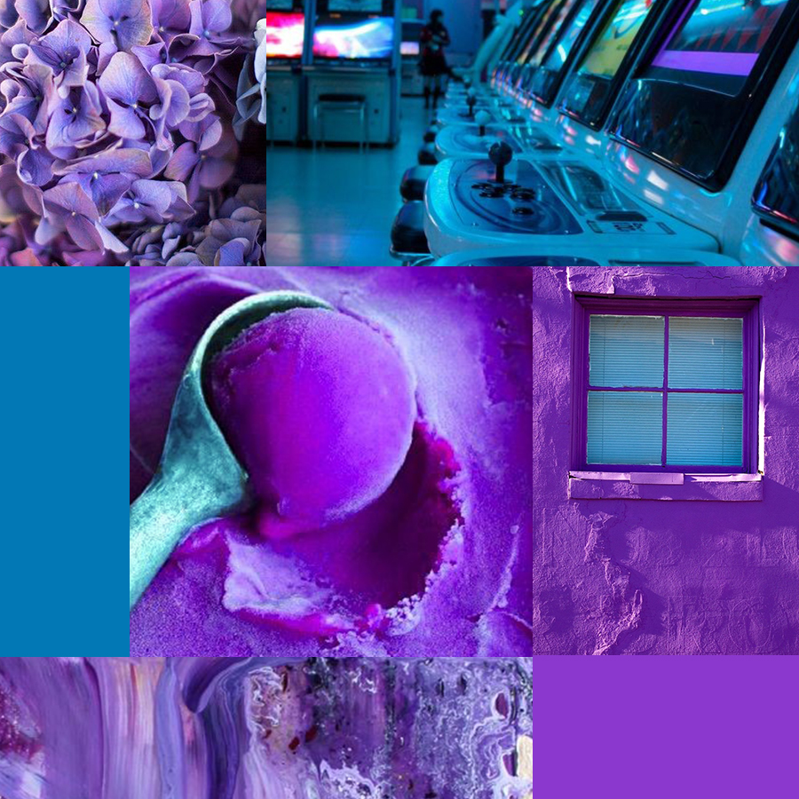
Oh boi. As recent as when I was a freshman in college, I loathed neon. I hated it with passion. When I see neon, I run to the opposite side as fast as I can. But I’ve recently (like just this year recently) come to love neon colors. If you add in black, this color combo will be p e r f e c t. Neon colors just have this moody retro urban feel to them. It’s really great for creating atmosphere and moods in an illustration.

I tried to do it in a full-color illustration one time and… welp. It didn’t work. But it was probably because the paints I used were more muted. So I learned that if you want to recreate the neon look on watercolour, you’d need translucent paints for it.

Cerulean and Moss

cerulean and moss - 5 color pairs I'm loving right now

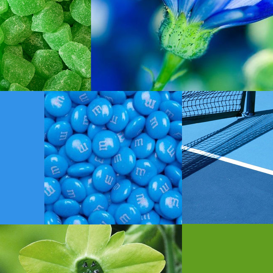
If Magenta was the color I rarely used as a kid, cerulean is the complete opposite. I freakin-loved this color! I would use it on every page of my coloring book. I’ve been saving nature landscapes from stock photo sites lately. I use them to practice on painting landscapes and I always get attracted to images with lots of blues and greens.

Blues and greens are classic color pairs that would always (always) work. I particularly love using cerulean with the less vibrant mossy green.

Mint and Peach

mint and peach - 5 color pairs I'm loving right now

*sigh* I love this color combo like you wouldn’t believe.

While I started to love pink, there’s nothing more beautiful than peach. Peach feels like it’s walking on that fine line between orange and pink, you know? I love that. And mint. Oh mint. I don’t know if it’s just me but it’s such a Gen Z color pair??? All pastel and bright and super aesthetic. This is the kind of atmosphere I want for my blog – fun and happy but also quite relaxing. I hope I achieved that 🙂

I WANT TO HEAR FROM YOU!

What are your favorite color combinations at the moment? Share them in the comments below! I’m always on the hunt for gorgeous colors 😉

xx Kate

PS. You can check out my previous post on color combos here!

8 Gorgeous Color Combinations I’m Loving Right Now

I don’t have any favorite colors. I like all colors equally. I believe that all colors are beautiful in their own little ways.

So once in a while, I’m gonna share with you guys the awesome color combinations I discovered and make a neat little list of them with pretty collages of pictures using these colors. This isn’t gonna be a regular feature, by the way. Just whenever I find a handful of gorgeous color combos. Okay? Okay! Let’s go!

But first, a disclaimer: None of the images I used in the collages below are mine and I will never claim them as mine. I found all of these via Pinterest and have made a board exclusively for this post. Please check out my Pinterest board if you want to know where I got them.
If any of the images below are yours and would like for me to take them down, please contact me through this page and I will do it as soon as possible. 🙂

Lagoon + Baby Pink

This is the more pastel-y version of my blog’s color scheme. (Also, notice how I used it in my headings and subheadings like with this post? 😉 ) I’ve been in love with this color pair ever since my blog revamp last year. Together, they create this light and fluffy feminine atmosphere and that’s exactly how I want my blog to feel. Also they kinda look like candies, right???

Cerulean + Mandarin

I wasn’t usually into dark and bold color combinations. And this color combination is super bold. I mean, look at those shades of blue and orange. They’re vivid and they contrast each other. But that somehow works because the orange pops against the blue. And I really really (really) like it when one of the color pair pops out and the other simply helps. It’s like a dance, don’t you think? 😀

Maroon + Gold

This is also a bold color combo but where the cerulean and mandarin has this heavy atmosphere, maroon and gold is more elegant. I mean, doesn’t that color combo remind you of royalty? It reminds me of that. Also GRYFFINDOR COLORS! (I mean, I’m a Ravenclaw. #AndProud. But still.)

Navy Blue + Rose

UGH I LOVE THIS COLOR COMBO SO MUCH I CAN’T EVEN asdkjefghsnml

This is a color combo I would wear in a heartbeat. Because I really like how the feminine feel of the rose color balances out with the masculine-ish feel of navy blue. Also light and dark shades. They contrast.

Purple + Dandelion

If you’ve noticed, all of my collages above have some kind of food included in them. And, I’ve checked, the rest below have too. Only this collage doesn’t and I regret not looking for a purple ice cream or cake *sheds a tear*

Anyway. Purple and yellow are the secondary colors of my blog color scheme (as you probably notice their “secondary presence” in my design). I added them several months after choosing my main colors. I love this color pair because they’re bright. And their brightness keeps the airy feel of my teal + pink main color pair grounded.

Baby Blue + Lemon Yellow

I don’t know why but when I see this color combo, it reminds me of a super cute doll house. DOESN’T IT OR IS THAT JUST ME? Like lagoon and baby pink, it’s a light color combo but it looks a teeeeny tiny bit less feminine and more youthful. For me at least. This is definitely the kind of color combination I like to use for a youthful and happy illustration.

Tumbleweed + Mustard

Don’t you just love earthy tones for fall??? I do. I do a HECK lot.

Honestly, mustard was one of those colors that I find hard to like. It reminded me of… well, mustard. And I don’t like mustard. (I’m a ketchup kind of girl ok??) But I remember seeing someone mix mustard with a earthy colors like meadow green and tumbleweed and that’s when I realized it’s actually a pretty color!

Not to mention, one of my favorite artists, Taryn (aka @taryndraws) absolutely makes mustard and other earthy tones loveable every chance she gets.

Dusky Cedar + Olive

AHHHHH ever since I discovered dusky cedar last year, I have been in love with it! It’s one of those colors perfect for autumn and with olive green, it’s much much better! I really like pairing different shades of red with different shades of green. They’re just pretty to look at <3

I had so much fun making the collages for this and I loved looking at the variety of color combinations I have here.

Your turn: Do you have a favorite color? What color combinations are YOU loving right now? I’m on a personal hunt for pretty color combinations so share your faves below!

Twitter | Pinterest | InstagramBloglovin